Wednesday, October 19, 2011

Photoshop tutorials.


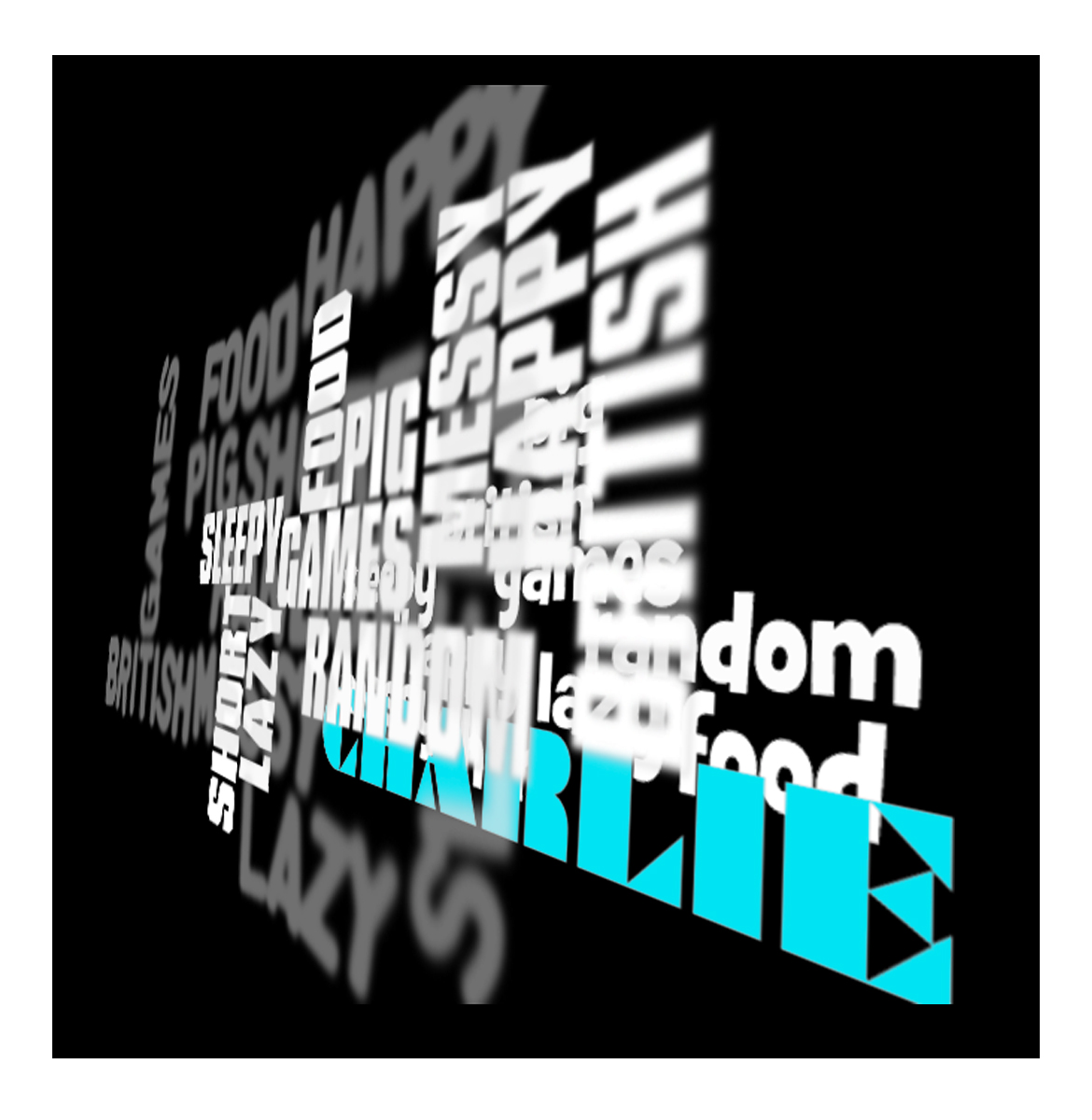
I like the effects that we used in this tutorial to create a 3D text. I don't really focus my work around typography so I don't think I'll really be using this technique so much.


 This is a tutorial we did to make it look like that our text is breaking and cracking. I like this technique because it is very effective and it looks very well.


Wednesday, 9th, 2011.

This what we created in our tutorial using the mask tool and overlaying as a technique.
We used the technique of an artist called Oliver Ottner.
I think I like this technique and I feel that I could well be using this technique very often in the near future for my work.


OWN ADAPTATION.


This is what I produced as experimentation using the knowledge of the tutorial.
I think I could have put a little time into this to make it look a little better and to adjust the shadows and the shape of the wood texture.


Wednesday, 9th, 2011. Tutorial number 2.


We where shown in a tutorial one of the techniques to morph a Hippo's head onto a Lizzard's body.
I liked doing this technique and this sort of Digital Manipulation is what I like to do in my spare time and also in my work.
So I feel that this tutorial benifitted me highly.
For the fact that this technique is a LOT more effective than the technique that I used to use before.


16/11/11

Today in our tutorial we worked on creating 3D images using this piano image to the right.


I think I like the outcomes of this tutorial and find that this technique will be used by me in the future in other images. .. And.. We get to keep the glasses.. =)


This is the image that I produced in the tutorial. Like I said in the last paragraph I like this image because it is quite useful if that is the sort of image you want to produce maybe a 3D animation. And now that I know how. It is quite simplistic and easy to do.


REFERENCE FOR FUTURE GUIDE-LINES.
  • Two layers
  • top= Cyan
  • Bottom= Red
  • Top.. Ctrl/Cmd+M> Curves.. Red.. 0 ... 251.
  • Bottom. " " " ".. Green.. 0 ..251, Blue.. 0 ...251.

OWN ADAPTATION.


This is an image that I created my self after the tutorial that we received.

I like the results of this image and feel that this tutorial was very helpfull and easy to understand that I'd be able to easily create a similar image in the future.


We used the masking tool to create a completely different skin on this rhio and gave him fur. We used a very similar technique to the woman with the leaf face project. Which was inspired by Oliver Ottner. I think that I'll probably use this technique more often than the way that I did this before. Because this was a pretty fun process and produced really cool results.


This is the latest tutorial that we did.
Seeming the source materials at first.
I really did doubt that they could produce this as a result.
But as we where shown by Martial what to do.
The pieces did start to come together and I was suprised that I actually produced this.


In this tutorial we used mainly the liquefy tool. I think that this technique was really effective and fun to do. All-In-All. I favour this tutorial. 

Wednesday, October 12, 2011

Be able to present own design out comes.

PHOTOSHOPCONTESTS


This is a piece that I produced on http://photoshopcontest.com/.

I like this piece that i did in particular because I put a lot of though into this image. The one thing that i have picked up on myself about this image that i could critisise is the direction that the shadow is pionting and the blurryness of this image.


This work was mainly inspired by an art movement called DarkArt. I came across it in my research and thought I'd look at a few examples of DarkArt on Google. These where just image searches. So I have no name behind them or Era.

I liked this type of art and thought I'd try and give it a go. But with a little less surrealism and a Tiny bit less darkness. . Because I didn't want it to be Angry dark.. I wanted to create a peaceful image.


This image when found on a Google search was named Alone In The Dark already. Which partially inspired the name of my image. Which I name there and then " Dancing In The Dark.

DARK ARTPrimarily a product of the 20th Century, dark art is an art style defined as that being "dark" or unsettling in nature. Called and classified under many names such as gothic, horror, metaphysical, nightmarish, and disturbing, it is actually a culmination of techniques and styles. It has been presented in many forms by many artists, illustrators and film-makers. It continues to grow in popularity as a part of the horror genre and gothic, music and publishing culture. Today, it is a part of our mainstream culture, crossing over into multiple mediums including advertising, television, film, and marketing. While it has roots in horror, it has been presented as collage, surrealism, abstract, motion graphics, grunge, expressionism, and largely digital art. These pictures are often referred to as "gothic" and many people think, they are somehow linked to gothic subculture but in fact it is an genuine misunderstanding.

The source of this information was from : http://en.wikipedia.org/wiki/Dark_art


I was quite suprised that in the feed-back that I received on this web-site, that no-one picked up on the direction that the shadow was pointing. Alot of the comments that I received didn't really make much sense. But there where a few that I could salvage. :):)


"Micose
nice mood, compistion. abit to dark tho and blurry at some places. keep it up !"

"shane.e.randall
Not bad, I like the textures and the lighting. Keep em coming. "


"Hagen
Very dark but the idea is really cool...! +1 "

"thantin
something wrong with generator......."


None of this feed-back that I received I could really count as constructive. But there where some elements that I could pick out where they mentioned some of the things that I also thought about my work.


There where no real restrictions for creating this image and the rules where pretty clear.. Which was the usual T&C ... No copyright and NO RUDIES! ;P


REVOLUTIONART

I did do some research and planning for a competition on http://www.revolutionartmagazine.com/how_to_participate.html

But as I partially created this image. I was told that the dead-line was already passed and could not even enter my unfinished work. :'(:'(


Be able to originate work using image manipulation hardware and software.

Be able to digitalize source materials.


The first competition I entered was on a web-site called http://photoshopcontest.com on October, 28th 2011.

There where no specific requirements for this image apart from the Terms And Conditions which where specific rules to what you can and what you cannot do.


It took me a while to plan what I could do with this image because it wasn't easy. So I went through the process of deciding what it will look like with a list.


LIST


  • Will be night time in this image and use the part of the boat or corridor image to create the sense of reflection.
  • I think I'll center the subjucts in this image and put them in the light of the image.
  • I think the subjects will be two people dancing..

I took me a while to think about what the subjects in this image would be as there is not many things you can put in this image that would make somewhat sense in my mind. I chose two people dancing because it was merely a cliche that is comonly used and it was the only thing that I really could think of that would make sense. When I posted this entry, people often mention that it was too blurry in parts and maybe a bit TOO dark . I think to have made this image make a little bit more sense was to maybe add little glows of light coming through the windows of the boat like image. This was because my image was intentionally dark and that I wanted it to be slightly blurry to give a slight magical effect. Some of the feed-back that I received was that most of the people who viewed my image liked it but thought that it was a little too dark and also a little bit too blurry so I think those are the key improvements that are mainly needed.
I also received some possitive feed-back like there was good composition and that it was a good concept. because this contest had such a short time to complete I rushed this image a little bit so the shadows of the two people are facing the complete wrong way, OOPS. :S

"Micose
nice mood, compistion. abit to dark tho and blurry at some places. keep it up !"

"shane.e.randall
Not bad, I like the textures and the lighting. Keep em coming. "

"Hagen
Very dark but the idea is really cool...! +1 "

"thantin
something wrong with generator......."


The second competition that I have entered is on www.worth1000.com. This one was a themed one. And I had to creat an image that depicts a "Bad Santa". This took some time for me to come up with an idea. But in the end I came up with an image of a skull because that's normally associated with bad things and such. My skull's source image came from Google. On, http://www.google.co.uk/imgres?imgurl=http://media.screened.com/uploads/0/2709/209665-human_male_skull_large.jpg&imgrefurl=http://www.screened.com/human-skull/30-417/&usg=__qAmHNe2ekFCj9u2BKdAaaKbwj6A=&h=385&w=300&sz=18&hl=en&start=14&sig2=UddwMwA0MbYhpTDSldvRLw&zoom=1&tbnid=Z1QvnCUPu6HXZM:&tbnh=123&tbnw=96&ei=rlvfTp61NIey8QOw37nLBA&prev=/search%3Fq%3Dhuman%2Bskulls%26um%3D1%26hl%3Den%26safe%3Dactive%26client%3Dfirefox-a%26sa%3DN%26rls%3Dorg.mozilla:en-GB:official%26tbm%3Disch&um=1&itbs=1.
Then I used this image as a reference to use the paint tools on photoshop to recreat it and paint it myself.
Then I decided to put a christmas hat on the skull so it was all "Christmassy" .. But then another idea came in my head to use a " BAH HUMBUG" Hat. Because it was associated with a saying from a film I'm not to sure what the movie is called but There is a guy and he's not in the christmas spirit and such and " Bah Humbug" is like a christmas curse word or something. So I thought if I used this image it would make the image seem more like a Bad santa.
I also looked at past contests with the similar title of bad santa and gained some inspiration behind my images. Which was mainly the skull with the hat on. I saw quite a few that look similar. But in my honest opinion. The edits they made where REALLY BAAAAD! So I decided I would take some elements from ideas and make them my own. By spending time on my work and perfecting the mistakes. And thats where i decided to paint all of my source image references, because then I'll know that I wouldnt have the typical annoying white line around my cuts.


Things that i could have made better. I would say is the shadows on the table. Because they seem to not even be dark enough. As the shadow on the actual skull is darke. I think that I could have spent more time on the skull to make it more and more detailed. But I didn't really have much time.. Because I needed to start working on my third project.


The original of this image is merely the same just the orange stripes are only on the fallen sign post.

The reason I came up with the idea of putting the orange stripes pretty much everywhere I could in this image was because I wanted to create humour. 

Understand how image manipulation techniques are used in the work of others.


ARTIST RESEARCH.

I really like this image too. But also I don't. I like that this image has tried to create a concept that is true.. By using, once again the power of image manipulation. When I look at this image I see farming. And how Chickens are killed to provide food. I think that this is what this image is trying to depict.
There is also a reason that I do not like this image is that it also comes across as somewhat violent. And personaly I dopn't really like violence. I just like the concept that this image puts across. I think that maybe the artist used a source image originally of the Chicken and then used the cut out tool to create a seperate image of some blood.. Or maybe this wasn't originally blood as blood as far as know does't really get seen like that. I think like the tetris image they used the smaller images in the photo and planted them on top of the source image.

This image was created by La Souris Sur Le Gateau.
The name in the link will lead straight to the artist's web-site!!!!


ARTIST RESEARCH.


I chose this piece of work because this was one of the favourite pieces that I have seen with image manipulation. I like this work because it is very surreal. And most of my work generally seems to be surreal. I like the concept of surreal art because it is always so whimsicle or to good to be true.. Or just impossible. I like that this person has made these things possible with the art of image manipulation.


One thing that I could say about this is maybe that it is a little too dark and maybe needs to be in grain and not B&W ... Partially because maybe if it was a little in colour it will be more recognisable.. Or maybe use colour splash. Though i find that colour splash is OVERLY used in peoples work.

You can tell that this work is digital.. Well because it is an image manipulation. And that it well... Impossible.

I think the guy used a source photograph. Maybe taken by him self.. Maybe not. I'm not entirely sure.
And that maybe he created the tetris blocks him self. And just placed one image on top of each other.. And maybe I suggest that's ehy he used black and white because it somewhat hides the effects of photoshop. In my opinion.. I find this technique quite lazy. But then i have done it myself and cannot really coment on this guys work as such.
Thsi image was created by Erik Johanson
The name in the link will lead straight to the artist's web-site!!!!


ARTIST RESEARCH


The person who created this image is Simone Legno.
The name in the link will lead straight to the artist's web-site!!!!

The reason that I have chosen to research on this image is because this image doesn't really appeal to me. The style of the image does not really appeal to me.

By the looks of the image itself the technique used to create this image could well be digital.

The reason I don't really like this style is because it doesn't seem real enough for me and I'm not really into the japanese anime style art.

This is merely an opinion because I've seen so many people get into this scene so easily and how it effects there lives .. Clothes... And social lives. I generally associate this with easily influenced peope.


DIGITAL ART RESEARCH.

Digital art is a general term for a range of artistic works and practices that use digital technology as an essential part of the creative and/or presentation process. Since the 1970s, various names have been used to describe the process including computer art and multimedia art, and digital art is itself placed under the larger umbrella term new media art.

The impact of digital technology has transformed activities such as painting, drawing and sculpture, while new forms, such as net art, digital installation art, and virtual reality, have become recognized artistic practices.[3] More generally the term digital artist is used to describe an artist who makes use of digital technologies in the production of art. In an expanded sense, "digital art" is a term applied to contemporary art that uses the methods of mass production or digital media.

My source of this information was taken from : http://en.wikipedia.org/wiki/Digital_art


OLIVER OTTNER RESEARCH.
Oliver Ottner was born in 1974 and lives in Vienna, Austria. In 1999, he founded the advertising agency iService, which works for clients such as Estée Lauder and the famous Vienna Zoo. His private works, such as his naturemorphosis and dualism series, as well as original Photoshop tutorials, can be found on his personal site www.effectlab.com. Oliver has been a National Association of Photoshop Professionals (NAPP) member since 2001, and his work has been recognized in various photography and digital art publications, including Computer Arts.

The source of this research is: https://www.apress.com/index.php/author/author/view/id/2783.


We recently did a tutorial about textures images being placed on top of peoples faces and other objects using the technique of Masking. We did our research based on the web-site: http://www.naturemorphosis.com/. I liked this technique that we learned. And I find that I will be using this technique very often in the near future for my work.